Every year I really look forward to this exhibition. NEAC has a lot of excellent artists and the standard of painting is generally very good.
 |
| NEAC 2012 - The Threadneedle Space |
I find a really good test of an exhibition is to think about it the day afterwards and see what you can remember. If it's got strong visuals and work which is visually striking then it pops up straight away - and therein lies the rub. I can remember one really good wall and some excellent paintings by a few artists and that's it.
It may very well be me. I have, after all, just recovered from a nasty bug, have been feeling very drained and am still less alert than usual.
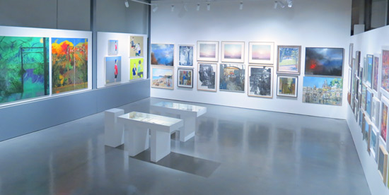
 |
| NEAC 2012 - The view as I entered the North Gallery |
For example, by way of contrast, here's my comment on the 2010 Exhibition
I walked in and more or less immediately made a note as follows "an object lesson in not being bashful or reticent". The exhibition was bright and full of large and attractive paintings which were singing with colour. There was something very energetic and vibrant about the work on show. It is also hung very well with well positioned pieces which knitted walls of paintings together and created a very good impression.Maybe that exhibition set the benchmark for me? Maybe I now expect all their Annual Exhibitions to be as good as that one was? However I've looked back at my photos of previous exhibitions and they just "look" better! (You can find links to previous posts reviewing previous NEAC Annual Exhibitions at the end of this post.)
Maybe it's this year's Selection and/or Hanging Committee? I actively disliked the end wall in the West Gallery which, for me, is the "set the tone/make or break" wall in that gallery and for the whole exhibition. So much spins off that wall.
Maybe the Selectors this year like very different things to me in visual terms. I have no idea whether they rotate or it's the same people every year. Maybe it's the need to find paintings which look good in the Threadneedle Space that's unbalancing the rest of he exhibition?
It's just all very odd. I'd gone expecting to be energised and instead came away feeling a tad deflated.
Anyway having done this review the wrong way round and started with the negative - I shall now relentlessly try and pursue the positive.
Prizewinners
The Doreen McIntosh Prize: Eyjar by Sophia Rizvi (Non member / Open Entry).
This is a really strong painting which I think must come from a series she seems to have painted in Iceland. A little bit of detective work suggests this is probably a painting of fire, water and steam and an extremely new part of Iceland in Vestmannaeyjar (aka the Westmann Isles). Such a pity this was hung in a corner when to my mind it should have been a pivotal painting holding a wall together. Take a look at the Threadneedle Space photo to see what I mean. (I can only imagine that this is Jacqueline Rizvi's daughter although their painting styles are in no way alike.)
 |
| Eyjar by Sophia Rizvi 0il, 42 x 52 inches £5,500 Winner of the Doreen McIntosh Prize |
Also hung in the Threadneedle Space, this is the sort of painting I expect to see at NEAC - big, bright, bold, painterly and begs me to come hither from 30-40 feet away. It's interesting that it comes from the brush of a non-member. He has two works selected and they were hung together and looked excellent.
 |
| Bowler Hat by Paul Gildea oil, 29 x 47 inches £8,000 Winner of the David Messum Prize 2012 |
I am painting the world around us, just a picture of the flesh, the matter made visible by life-giving sunlight, copied to the canvas before the sun moves too far, the bus drives off or the model complains and leaves...The Manya Igel Prize: Reflected Cloud Formations (Egg Tempera) by Ruth Stage NEAC.
I was very pleased to see Ruth Stage winning a prize. I absolutely adore her egg tempera paintings and need to work out how I can afford to buy one or two or three - although I think her work is a bargain! This one for me was symphony of very quiet muted colours with just a flash of blue. It's an exercise in quiet restraint and texture in 2D.
 |
| Reflected Cloud Formations by Ruth Stage egg tempera, 32 x 28 inches £2,900 Winner of the Maya Igel |
The Prize of the Worshipful Company of Painter-Stainers: The Voices of Silence II by David Carpanini NEAC
This is a somewhat unusual painting in that it's pencil and watercolour. It's very well drawn and I lke the painterly effects with the washes. I'm not sure I'm as convinced by the grouping of the figures. It just feels a little too staged for me.
 |
| The Voices of Silence II by David Carpanini Watercolour and pencil 40 x 47 inches £3,250) Winner of the The Prize of the Worshipful Company of Painter-Stainers |
I've seen several paintings by Peter of his studio mantlepiece but I think this is the first time I've seen a painting of the fireplace in all its disorderly glory. I exempt this painting from the boring studios category as it comes across to me very much as an "as is" painting with Peter painting what he finds in his own studio very much along the same lines as how he paints the streets of Bath - he paints whatever is there. It has integrity.
 |
| Studio fireplace by Peter Brown |
The Arts Club Dover Street Prize: I didn't spot this one.......
I note the number of prizes has reduced. This seems to be the way of the world for art societies in these difficult economic times.
Work I liked
Inside the door, near the Reception Desk there is a wall of very strong and attractive paintings of various sizes by various NEAC members Saied Dai, Diana Armfield, Ruth Stage, Fred Cuming and Bernard Dunstan - all artists whose work I like. That was the "WOW" wall for me with Ruth Stage and Fred Cuming as the standout painters. I'm very tempted by Intense Light Verdon by Ruth Stage.
 |
| Paintings by NEAC members: Diana Armfield, Ruth Stage and Fred Cuming |
 |
| North London Summer (oil, 44 x 52 inches £5,500) Regents Canal at Angel (oil, 34 x 54 inches £5,500)
© Melissa Scott Miller
|
 |
| Paintings by Judith Gardner (click this link to seem them in more detail) |
 |
| Add caption |
 |
| Etching and watercolours by Richard Bawden Charcoal and chalk drawing by June Berry |
Some final points
- I tracked around the gallery marking up sold paintings in the catalogue as I went. It's very clear that the £1k is a very strong barrier to purchases. I noted more sales below this level than above it - with £850-£950 being a popular banding which was generating sales. I see little point in pricing just above £1,000.
- Some artists were doing well at selling work - notably artists I liked!
- It seemed to me that there was some confusion as to the purpose of the far North Gallery which is emulating the Small Weston Room of old at the RA's Summer Exhibition. It struck me that those whose works arrived in this room via the open entry appeared to understand very well that small does not always necessarily equal 'cheap' or 'fast'. Some members work also looked very good however some had included work I'd never ever see in any other exhibition - so why this one? While I can well understand some desire to offer some rather more affordable paintings it seemed to me the standard of work on offer was just too variable and some works were "letting the side down". Whether affordable or expensive, to my mind the standard should be that ALL the work must be excellent. That way lies more sales as this approach makes all the work look good! :)
See my post on Sunday for details of the events this week.
- 2011: Review: New English Art Club Annual Exhibition 2011
- 2010: New English Art Club Annual exhibition 2010
- 2009: Exhibition Review: New English Art Club - Annual Exhibition 2009
- 2008: New English Art Club - Annual Open Exhibition 2008 - Making a Mark
- 2007: New English Art Club plus commentary and discussion
Thank you for the review, giving us a peek inside. Really like the look of the Ruth Stage painting, like Peter Kelly's work. I won't see the exhibition but your review makes up for it!
ReplyDeleteProper painting....how wonderful!
ReplyDeleteWhat a well-written post. I must say that from your photos, I do like the way this was hung. And of your posted pieces, the ones I really like are Paul Gildea, Peter Brown, and Melissa Miller pieces. Didn't really care for the others so much but then I suppose it comes down to individual taste. What did catch my thoughts is when you said "same old same old" about many artists' works. I often think that looking at some of the blogs out there. Sometimes it is hard to tell one artist from the next and I find myself scrolling to the top to see whose blog I am visiting. I am always amazed too at the apparent successes of some artists that I think are lacking something. I guess, once again, a matter of taste. That all said, I am hardly qualified to be a critic; I just like what I like and try to paint what does interest me or grab me.
ReplyDeleteI realised after posting that the problem with posting only some of the images is I'm providing no evidence for my comments - so you'll just have to take me on trust re the disappointments I had.
ReplyDeleteI couldn't agree more about the pictures on blogs. I sometimes feel like I'm trying to spot the X fact in amongst the "wannabees"!
I totally and absolutely understand why people emulate artists they like as they're starting out - it's a really good way of learning. However there comes a point where you have to develop your own voice / visual way of seeing things.
That said, there for the more mature artist, there also comes the issue of "where do you go from here?" It's no coincidence that some of very impressive artists have found ways to reinvent the way they see the world - and I guess one of the imperatives for doing that is so they also don't bore themselves with the work they're producing!
Thank you for sharing the exhibition. I couldn't make it. Such a detailed, thoughtful commentary.
ReplyDelete