Tuesday, February 28, 2006

New web links - landscapes and colour

Blogroll

I'm adding Terry Miura's Studio Notes into my blogroll of illustrated blogs about artistic endeavours. Although he paints in oils I have an affinity with his more recent subject matter (landscapes - with a lot of emphasis on trees) and his practice of life drawing. It'll also be fascinating to see how he gets on his new studio.

Artist websites

I bought a book by Nicholas Verrall last summer "Colour and Light in Oils
"
as I was just well and truly knocked out by his use of colour. He works in oils but I find his subject matter, its composition and treatment of both light and colour to convey the mood and spirit of time and place to be very appealing. And ignore what Artnet has him listed as - he's a UK artist!

John Hammond is another artist whose use of light and colour I very much admire. I'm currently reading a book of his which is ostensibly about "Capturing Light in Acrylics" but is actually about more of less every aspect of being an artist and the process of painting as a whole. However since I can't find a website with an effective link he can't be added in to the list!

Katherine Hurley is a colourist working in oils and pastels (and is an ex student of Wolf Kahn). Her website also focuses on the sort of landscape subjects that I'm becoming increasinly interested in. Do go and look at her galleries of archive and current paintings if you enjoy colour.

Monday, February 27, 2006

Drawing development in children

I was admiring the drawings been done by the 19 month old child of an artist friend of mine yesterday (I think she's been watching her mum at work!) and thought it very advanced. Which led me to try and find something on the web providing an illustrated and annotated description of how drawing develops in children.

which led me to finding this excellent website about drawing development in children developed by Susan K Donley and adapted from teacher inservice training materials for early childhood, art education, and special education workshops. This particular work was done for a teacher workshop.

Drawing development is analysed according to the views of Viktor Lowenfield - as expressed in "Creative and Mental Growth" and Betty Edwards - the latter being the author of a book I recommend to a lot of people starting to draw "Drawing on the Right Side of the Brain".

So interesting to see two perspectives on drawing development in children of different age groups set side by side. They identify how the use of symbols by children develops over time and when their search for realism starts.

Maybe they could continue their good work for those of us who have left school behind us.........? I find the range of drawing styles in adults to be truly fascinating and wonder all the time about what it says about our education and ourselves.

, ,

Le ciel avec les nuages


The sky now has clouds!

This one is destined for the Views and Vistas Gallery on my website - but is it ready to go yet? I've reached the "ummmmmmmmmmm"ing stage ...............(not least because that scan stitch is looking a bit obvious!)

, , , , , , , ,

Sunday, February 26, 2006

Developing a plein air sketch - an update

Here's an update of the current work in progress - my coloured pencil painting of Domme in the Perigord in France. See this post for what came before.

I've developed the colours and the trees, got the canoes in (are they too big I ask myself?) and still have the clouds to do. I don't want to do these until I've got the values and colours sorted out elsewhere as they need to be really subtle. This image is a stitched scan as the scanner is able to produce a better representation of the colours.

, , , , , , , ,

Saturday, February 25, 2006

Developing a plein air sketch

In 2004 I spent two and half weeks in France painting - starting near Bergerac where I spent a week, meandering down the River Dordogne and through Gaillac via good restaurants over a long weekend and then spent another week painting near Carcassonne in the Languedoc.

En route during that long weekend I visited Domme which is a bastide town in the Perigord region I'd last been to Domme in 1976 and was intrigued to find out whether it was as I remembered it - and whether the view was still amazing. More tourist shops than I remembered - but the view was every very bit as stunning, albeit it was midday rather than early evening!

I had lunch sitting on the terrace of the Hotel L'Esplanade. The hotel enjoys the most amazing views over the River Dordogne towards the Cingle de Montfort. And I've been meaning to develop the sketch I made during lunch into a painting for some time now.


First image is the sketchbook drawing I did during my lunch. It's a double page spread in my A4 size black hard back Daler Rowney sketchbook - and I used my coloured pencils to sketch. They're very handy and don't require a water pot!

Notes at the bottom of the sketch indicate that I had Sandre (Pike) with morels, tomatoes and physallis and then Tuna (but I don't think I remembered to write all the food down) and that a nearby roundabout turned to the sound of the theme from "Titanic"! I like making notes about my environment on my sketches as they always help to provide better memories of the whole experience.

Also posted are some early stages of the painting. I'm doing it on Arches hot press watercolour paper (in a block) using coloured pencils - which seems quite appropriate given it's French paper! It's 12" x 16" in size (a classic 3:4 ratio).

, , , , , , , ,

Thursday, February 23, 2006

Drawing Monet


...........and then after I'd been to the lecture and visited the exhibition, without drawing breath or even having a cup of tea I raced around the galleries seeing all my favourite paintings before finally remembering that it was Wednesday and late night opening! It was the music being played which reminded me!

So finishing my gallup in the Impressionist rooms I sat down and did a sketch. I used a mechanical clutch pencil across two pages of my black Daler Rowney sketchbook, of a couple of Monets. This is a merged scan of the double page spread which is equivalent in size to A3 .

The problem of having people in front of me constantly viewing the paintings was resolved by having three on the go at once - so which ever one they stood in front of I did one of the others. But then I had the problem of how to represent the fact that people were always coming and going. And so I used a technique I learned recently - which is to suggest them without giving them full form. After all they are transitory and the paintings will go on in this place for ever!

, , , , ,

Americans in Paris

What I didn't realise yesterday was that it was the first day of a new major exhibition at the National Gallery on "Americans in Paris 1860-1900".

So, of course, I bought a ticket after my lecture and went to see it! I'm saving up the Mary Cassatt Prints - being exhibited at the same time - for later. The exhibition comprises a lot of work by Singer Sargent, Whistler, Cassatt, and Childe Hassam together with a few examples from a range of other artists. Whistler's Mother was framed by a couple of other paintings using the same design format - which made an interesting perspective. It was stunning to see Madame X next to the very large painting of the Boit daughters. Paintings I particularly liked were the portrait of William Walton by James Carroll Beckwith, Grey Day on the Charles by John Leslie Breck, Claud Monet painting by the edge of a wood by Singer Sargent.

There are a number of events associated with the exhibition and I'm currently thumbing through them trying to decide which to book for!

It's an exhibition which I'd highly recommend to anybody visiting London between now and May.

, , , ,

Playing with the Provisional

I went to the National Gallery yesterday, ostensibly for a lecture on drawing - and did so much that it looks like the visit now needs to be three separate posts! This is the first.

The current lecture series concerns an Enquiry into Drawing and is being delivered by Deanna Petherbridge, the Arnolfini Professor of Drawing at the University of the West of England, Bristol who was previously Professor of Drawing at the Royal College of Art. . The one yesterday concerned the nature of drawing on a provisional basis as part of the process of creativity - and is summarised below.

A distinction can be made between the open-ended sketch and more finished and systematic aspects of drawing, especially those intended for objects, or transformation into other media (such as sculpture or architecture) or as templates for mass-production (such as industrial design or fashion.)

Indeed the historical categories of plan, elevations and detailed working drawings on which most design and engineering practices still depend (incorporated into CAD systems) and the formal techniques of projective geometries, directly reflect the time-based procedures and modes of production of manufacture and/or building.

Yet the most important moments in these linear design processes are those interruptions when new ideas are tried out and tested through the provisionality and spontaneity of the hand-sketch.

It was amazing to see the slide of the drawing of Sir Joseph Paxton's idea for how to construct the Crystal Palace literally sketched out in pen and ink on a piece of paper that looked as if it could indeed be the back of an enevelope! Similarly, Frank Lloyd Wright's drawing of his concept for the house called Falling Water in coloured pencil. Interesting also to see extracts from Leonardo's sketchbooks and how the drawing and the text are interwoven as he works out and then records how something should work. Also to hear how Caro would not allow students at St Martins College of Art to draw or speak as they developed their skills in his scupture classes - but that he came back to drawing as he himself got older.

Some of the notions highlighted included:
  • the concept of sketching is absolutely essential to the cognitive process of creative thinking
  • developing a design has an evolutionary process
  • ambiguity in drawing is important in terms of avoiding early on the exclusion of possibilities for how a design might develop
  • drawing over and over at the beginning - as Matisse used to do - provides a sort of rehearsal for what comes after in terms of the more refined line and the finished drawing
  • sketching out an idea can be done in a lot of different media and can also be a collaborative effort albeit orchestrated by one person.
  • drawing need not be the beginning of a process - it now exists in its own right.
The idea also that and that drawing for design can now be very dominated by CAD systems - which don't allow for the "trying out" and confusion and ambiguity which comes from "first thought" drawings. And that a lot of people now mourn the passing of the hand-drawing skills for the recording of first thoughts.............

, , , , , ,

Tuesday, February 21, 2006

Postcard from Provence

One of my very favourite blogs - and probably the reason why I started getting into blogging - is "Postcard from Provence", a diary in paintings.

Julian Merrow-Smith has lived in Provence for the last 8 years or so in a tiny village called Crillon le Brave. He describes his blog as
an ongoing project involving painting and posting a small oil painting, mostly daily, in which I try to reflect the changing seasons and light of my adoptive home in Provence.
and
The idea for this site germinated over the winter of 2004/2005, in no small measure due to the arrival of ADSL in the provençal countryside, my interest in webdesign, webstandards and blogging and finally, stumbling across the enormously successful site of one Duane Keiser
Julian's (almost always) daily paintings are delightful and extremely accomplished. He's now completed about 300 and I look forward to them dropping into my e-mail inbox every day and am very rarely disappointed. This could be because they very often feature food!

And today I received a newsletter from him. He describes the project as an enormous success with the site now getting 1,000 visitors a day!!! All I know is his small paintings priced at $100 sell extremely quickly. And a quick glance through his galleries reveal an awful lot of red spots!

However the big news is that 'Postcard from Provence' is to be profiled in the home section of the New York Times on Thursday 23rd Feb.

Julian's main website and his other blog "A Painter's Journal" and are also listed in the right hand column. Take a look - you won't be disappointed.

Duane Keiser's blog "A Painting a Day" is also listed in my blogroll. As with Julian - if you've not seen Duane's work before do take a look - his subjects are a little different and often surprising though, although for me I often think of him as the master of the broken egg!

, , , , , ,

Freiluftmaler

Freiluftmaler means "Free Air Painter" according to my Google translater. This is a new blog in my blogroll which contains plein air drawings and paintings from the sketchbooks of Martin Stankewitz who lives in Germany.

Martin does delightful pen and ink drawings - and you don't need to be able to read German - just LOOK at his lovely drawings of traditional buildings

Martin has been blogging for quite some time and also has another couple of blogs which are also well worth taking a look at:
  • Mein Maulbronn - for artwork associated with the town of Maulbronn and the area in which he lives
  • Edition Handdruck - for the original fine art prints he produces

, , , , , . , ,

Kew Gardens in February


Last Friday, my partner and I went to Kew Gardens for the day. And I've been meaning to finish writing this post since then - but with no sketching and 178 photos it was difficult knowing where to start.........or middle or end!

I haven't been in yonks and wondered how much it had changed. It has of course acquired a World Heritage site status in recent years and one should never forget its Royal status. Here's the Royal Botanic Gardens at Kew website if anybody else fancies a visit or just a 'look-see'.

I'm minded to pay regular visits for plein air painting over the course of a year as I can get to it quite easily on the tube. It's also a very civilised place to go as it has "facilities" liberally distributed around its very many acres. On the map I looked at, I was reminded that they divide it into three distinct areas and suggest that each area would easily take 2-3 hours to see so it's not really possible to do the place justice even if you are there for the whole day. And that sounds very like visits in the past - we've always ever done bits. But that does mean oodles of things to draw and paint. So having noted the current entry fee (£10) I decided to do the sensible thing and become a Friend so I get free entry in future.

Anyway - because it was bracing weather (ie OK if you kept walking briskly and ****** cold if you sat down) we toured the three glasshouses - enjoying in particular the 30 degrees centigrade in the Palm House! Our glasses steamed up as did the camera lens of course! And they seemed a popular place in which to sit and sketch.

The Princess of Wales glasshouse was hosting the annual orchid exhibition. And somebody had decided to create an "artistic theme" - and lo and behold we have brushes and paint!


I'm not really sure what to include on the botanical front - so much to choose from! However here goes - two sort of spiky ones - both macros - one soft and one not: Japanese Witch Hazel and a close-up of a cactus.


, , , , , , ,

The return of Crack Skull Bob

I've been taking a look at a few more illustrated blogs and one that I very much like the look of for both insight, visual impact and humour is "The Return of Crack Skull Bob" by Wally Torta at www.wallytorta.com (I haven't quite worked out yet why it's called that but I guess he probably had a good reason.)

And Wally very much qualifies on the sustainable blogging front having been blogging for a year now.

It's going in my blogroll of illustrated blogs and I'm definitely subscribing as well.

, ,

Monday, February 20, 2006

A portable sketching kit

I expected to be able to sketch last Friday and took one version of my portable sketching kit with me - as it happened cold weather and having partner in tow conspired against me (he doesn't mind sitting around while I sketch in warm weather and knows to bring his book - but he's much less patient in cold weather!)

So I thought I'd just show you what I took out with me. My kit on Friday for colour washes comprised:
  • Van Gogh watercolour pencils - in their very nifty folding blue cases

  • a Pentel brush with an in-built water reservoir. This works rather like a cartridge pen - releasing just enough water to moisten the pencils - but not flooding them


  • a small Winsor and Newton Wire-O Sketchbook - size A6 (10.5cm x 14.8cm) - 170gsm/80lb heavy weight acid free paper with perforations so they can be removed easily


So you can now see how neatly I write when trying out my watercolour pencils in my new sketchbook while on the tube travelling to Kew Gardens! ;)

, , , , ,

BlogHer.........and illustrated blogs

My art journal has been highlighted in a post by somebody who belongs to BlogHer commenting on the number of illustrated blogs there are. It then seems to have been highlighted on BlogHer - and generated a few visits to this site.

BlogHer lists blogs by women in a number of different categories. Unfortunately, although the main categories are quite extensive they don't have a category for art journal and illustration blogs - which means that the blogs of any women like myself which have been listed on BlogHer can be found all over the site - in Entertainment and Arts (which then gets shorthanded to Entertainment - not a word which I particularly associate with my artwork ;) ); in Hobbies (along with every other manner of hobby!) and Personal Blogs - and I guess a few more where the rationale is obvious to others..........

Anyway, I have now registered with BlogHer, listed my journal in the Personal category and have asked for consideration to be given to introducing a category for illustration and art blogs produced by women. If anybody else registers with BlogHer maybe you could do the same?

In the meantime, I'll be diving in and out of the blogrolls on other artist's sites as I usually do so that I can add more to my own. There are some absolutely fantastic blogrolls out there!

And I'm going to include a link to BlogHer in the right hand column.

Sunday, February 19, 2006

Art quotation of the week 19 February 2006

"Landscape is nothing but an impression and an instantaneous one"
Claud Monet


What Monet is talking about here is the way in which a landscape is a product of a particular set of factors which combine to represent it in a particular way on a particular day at a particular time. He was fascinated by light and how it changed how a subject looked. This is reflected in his "series" paintings in which he painted the same subject again and again - but each time in a different light.

It's impossible to paint a landscape without having to find some way of adjusting for the fact that the light changes while you are looking at it and as it changes so do all the colours and shadows (and forms) in the landscape.

Plein air painters endeavour to catch the moment by working out of doors in front of their subject and either working fast and completing a painting in one go. Oil painters usually refer to this as "alla prima" (Italian for "first time") - they complete the painting without building up layers. Others return to a landscape and continue with the painting when the conditions prevailing are the same. Monet always had a large number of paintings underway at the same time and would only continue painting if the conditions in which he started it were reproduced.

Working at particular times of the day can provide a plein air artist with light which stays similar for longer. Early morning and late in the day in more temperate zones can provide an interesting light, interesting shadows and a sun which seems to move more slowly than when it is high in the sky.

However, when I'm traveling, the option to return to a landscape is not always possible. I've developed a practice of completing a fairly detailed sketch to record what attracted me to the landscape in question and something about the colours. I then take a lot of photos to remind me of details within the scene. The challenge when starting to paint back home is finding a way of reaching back to experience that "instant experience" which initially attracted. Invariably I find that the best way is always to do with having drawn the scene rather than just taking photos of it. By drawing it you really look and end up understanding an awful lot more about how it works.

And why am I wittering on like this? Because I want to get to grips with a landscape painting which has been in the planning stages for some time, of course!

,

Drawing a Head


On Thursday evenings I go to my "Drawing a Head" class. I've been drawing lots of people - both models and artists for ages now - but in the last three classes I've finally started drawing heads again.

Here are drawings from the last three classes I've attended.

  • A male head and a female head - both took about an hour each
  • the full size male was a quick drawing in about half an hour
  • the female head with a background took about an hour and a half, and finally
  • the final male head was about two hours

They are all done on heavy white cartridge paper - size A2 (which is approx. 23.5" x 16.5"). I use a mechanical pencil (no sharpening required) to do fine hatching marks for the shading of the form and then a 6B graphite stick to get the darker values and provide a smudgy background.

, , ,

Fur in the Paint

My good friend Gayle Mason, who is an accomplished animal artist, is starting a blog relating to her art and her furry family - called very aptly "Fur in the Paint".

Gayle is a very talented and very organised lady. She has a demanding job, looks after her rough collies (the furry family) and three chaps (the non-furry family) and, at the same time, produces fine art paintings of cats and dogs, arranges the production of fine art prints and manages her on-line store listings and distributes her prints to her very many satisfied customers in the UK and overseas. She even fits in the odd commission from time to time!

Her activities also include showing her collies at various dog shows around the country - with Juno (her youngest) appearing at the Pastoral and Working Dogs Day at the Crufts Dog Show on 9th March this year - and sharing her techniques for drawing stunning eyes and fur in both cats and dogs.

I feel tired just writing it all down. Gayle on the other hand just gets on with it "doggedly" and quietly and excels at delivering high quality output (be it dog or drawing) to deadline. She is simply amazing.

The link to her website with its galleries of cat and dog portraits is in the right hand column - and this is the link to her new blog - she's half way through introducing the furry family - three down only four to go!

, , , ,

Saturday, February 18, 2006

Permalinks in the title

Just a quick note to say that I'm going to be making each title a permalink in future.

I'll also be working my back (slowly!) through previous posts to create permalinks in their titles.

Friday, February 17, 2006

Baby Radishes

I decided to try doing the small works the next size down 6" x 4" - or, as in this case, 4" x 6". I've adjusted the price - 6" x 4" will be $75 and 10" x 8" will be $125.

These are baby radishes - teeny weeny - and the painting is coloured pencil on Saunders Waterford HP watercolour paper.

I used every sort of radish coloured pencil I could find! And I also used my Van Gogh pencils on this - and they are just dreamy - they slip and slide and you can push the colour around the paper - it's the least like "colouring in" that I can imagine.
The bit that made the difference was getting an olive coloured pencil to provide contrast within the leaf section.

, , , ,

Wednesday, February 15, 2006

More Mistral sketching - from the car


I wrote in French Window about the options for working indoors looking out when the Mistral blows in France. This post is about what happened when I ventured out on the day before!

Strictly speaking when the Mistral blows you might be challenged as to whether you are really doing plein air sketching in the open air if the air is whipping up a storm and you have to retire to the inside of your car with all the windows closed! That was the predicament I was faced with when I visited a small village in the Languedoc Rousillon departmente of south west France . There was really no prospect of sketching outside unless one had a good wind break, so I decided to tough it out - in the car!

This is a colored pencil study on apricot coloured Canson Mi Teintes. It is approx A3 size (16.5" x 22.5") and was produced as I sat in a car for about a couple of hours.

It's of the stunning view (with stunning wind!) from the promenade at the top of Fanjeaux - which has very strong associations with St Dominic and the Dominican brotherhood and activities around the time of the Cathars.

I've also included the quick study I did before I started. In this you can see how I divided the picture plane into rough thirds and aligned some of the major lines within the image with the third divisions - so the line of umbrella palms sits just above the mark separating the bottom and middle third, while the line of trees going into the distance sits on the vertical division between the middle third and the right hand third. It's not a wholly accurate drawing so much as way of working out which are the major marks within the image, how they work and where they might best be situated within the picture plane.

My colour study combines both:
  • an aerial view - looking at a subject from a great height (in this case a hill top village)
  • an aerial perspective - which is the effect that the atmosphere has on the colour of objects as they recede into the distance. Generally objects look bluer and more blurred than similar objects seen close to.
Of course, the joy of working with colour pencils in such situations is that there is no potential for nasty paint marks in the hire car! The big challenge on this one was getting the optical mixing right when developing the blues and violets (associated with the aerial perspective) of the distant hills.

What I intend to do is use this colour study to produce a more finished work in due course. I usually check both the drawing and the proposed crop back to photographs taken at the time and then use the colour study (rather than photographs - which as we all know are notorious for getting both values and colour wrong) as the basis for my studio work.

, , , , , ,

Tuesday, February 14, 2006

Burford Browns and Old Cotswold Legbars #2


As you will see from #2, the blue eggs in #1 aren't really quite that blue!

I'm almost inclined to change the image under the last post - I'm not sure whether it was the light in which I painted the blue eggs or the light in which I colour corrected the digital image but they certainly came out a tad too blue!

#2 is coloured pencil on hotpress watercolour paper (Saunders Waterford I think) and is size A4 (210mm x 297mm). This one has got to the "sit still while I have a ponder" stage - and I might tweak it a little further but it's virtually done. I find that putting images up on screen frequently helps me to see whether there is anything else I want to adjust.

The background is made up of colours used within the main image of the eggs and the bowl - but using different proportions. I find this lends unity to a painting when you don't want the background fighting in any way with the subject. It's also particularly effective when the subject benefits from having the coloured equivalent of "white space" around the image in order to set it off. I particularly enjoy making coloured greys - with variations across the page - from colours rather than using the manufacturer's greys. The optical mixing of colours makes them much more exciting even when they're being subdued!

By the way - for anybody who's into chickens - I found the website for Clarence Court the place where these eggs come from. The breed information is fascinating! It also has a "hencam" which shows you how the chickens live! The hencam has even been featured as part of "The Guardian featured the hencam as part of its "web watch" column.

Apparently watching hens potter around can be very restful so bookmark this one if you need a different sort of stress buster!

Technorati tags: , , , , , , , , , ,

Monday, February 13, 2006

Burford Browns and Old Cotswold Legbars #1


Don't "proper" eggs have absolutely wonderful names? I saw these on my shopping trip for food and had to have them for yet another still life! I think the combination of that shade of pale duck egg blue and brown is just amazing!

And I'm getting maximum value out of them as they "posed" for a 'small work' yesterday and have now switched to a bowl and will be making another appearance in a larger work which is in progress.

I really like doing eggs. I was first attracted to images of eggs when I saw Sally Strand's wonderful pastel painting of "Eggs Underwater" which is simply ENORMOUS! I aspire to having the nerve to do a pastel painting which is, in effect 3 feet by 4 feet. My very much smaller efforts started when I saw some wonderful photos of eggs taken by a lady whose handle is "Olika". These can be seen on my "Food" page on my website. This current "Small Work" (5" x 7" - tiny, tiny, tiny in comparison to Sally Strand's) and the larger one in progress are being done from life and the drawing has been 'eyeballed'.

, , , , ,

Saturday, February 11, 2006

When I turned the corner.............

When people ask me about my current style of drawing, I often joke with them about how it took me nearly 10 years (as in YEARS!) to learn how to scribble.

A few days ago I came across the images associated with this major turning point in my artistic life, the point at which I realised I no longer needed to be precise all the time and that I had finally acquired the ability to scribble. And since, for some people, that seems an odd sort of aspiration I thought I'd share a little bit about what happened and why I regarded it as "a good thing".

Neither of the images I'm posting are a great sketch or a great painting - but both will always be special to me because they mark the corner that I turned................

Before I begin I probably need to explain that I've always been "very good at drawing". I personally found that having an emphasis on being accurate made it almost impossible to sketch and scribble. I was very much into having control over my pencil of choice and being precise. If I tried to loosen up my drawing I'd end up thinking "that's not right" and then focus on correcting a drawing rather than making a picture with enough marks to make sense of it.

The turning point came while on my second painting trip to Bali in 1997. We stayed in Ubud (the cultural capital of Bali) and visited a cafe which has a pretty intimidating sort of backdrop for an artist. To quote from the current website for the Cafe Lotus (and do check it for the photos which show what I mean).
The setting is magnificent even by Balinese standards: a large lotus pond framed by ancient flowering trees with one of Ubud's main temple complex, Pura Taman Kemuda Saraswati, serving as a backdrop. 
It has potential paintings every which way you turn - the first time I visited in 1992 I think I spent about an hour wandering round and round totally transfixed by the place and totally unable to work out what to do.

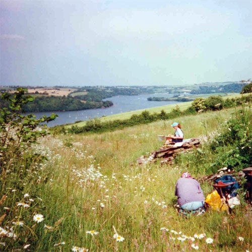
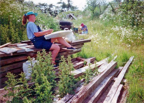
So on my second visit, I was armed with my sketch book and viewfinder and was determined to make life a bit easier for myself by working out what I was going to do "properly".


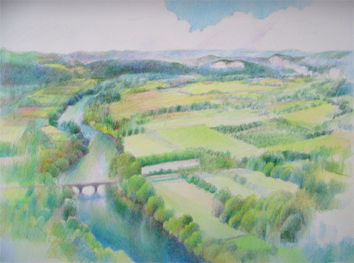
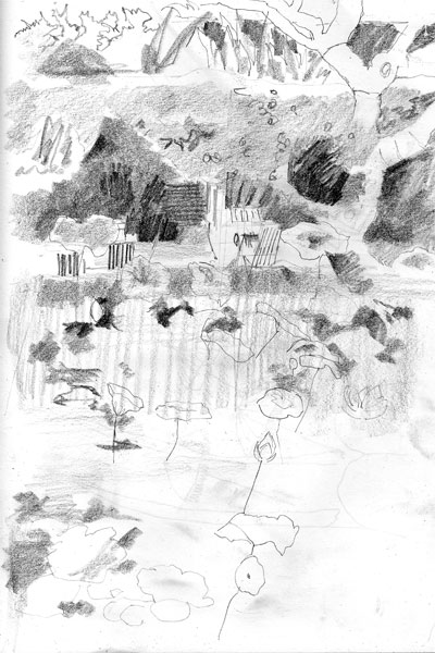
After wandering around with the viewfinder, I plumped for painting the view from the top of a stone plinth set into one side of the huge lotus pond which looked down on the pond and towards the long verandah area where people sat at rattan tables eating and drinking. In theory I was going to do the classic thumbnail sketch and work out the crop (the edges of the image), define and check my pattern of values in monochrome and work out what I wanted my focal point to be and adjust as required. All in a "thumbnail" of course!

 In practice, it didn't quite work out like that. My so-called "thumbnail" was a complete page of an A4 size sketchbook! But the focus on working out what to do and making decisions was there.

The really important thing about this drawing is that it is the very first one in which I didn't try to do a perfect drawing or even complete it when tackling a subject.

I knew that I needed to have some sense of the patterns in terms of the main forms and the values within the range that appeared relevant to this painting - but beyond that, time spent on drawing meant less time for painting. So I scribbled in as much detail as was required............

Focusing on a sketch as a working drawing rather than as an end in itself also meant that I could record important notes about the scene on the facing page of the double page spread. As I made my sketch I noted down what seemed to me to be the important things I needed to remember. On this occasion my page of notes is headed up with "rhythms" (which was obviously what I wanted the whole picture to focus on) "light and shade passages" and "verticals"(against the top section - the verandah area), "diagonal plates" as a reminder of how the lotus leaves looked and tilted and how they needed to be located on the page (note the single diagonal line in the drawing) and "horizontal" for the bottom section (reminding me about how the water looked). I wasn't a very articulate note-maker back then but I do find it interesting that those few scribbles and notes bring back my intentions and things I noticed on the day I was there.

Making notes is a practise which I continue with to this day. I don't always get to finish work on site and it's always useful to have reminders of what the colours were, what the texture of something is or looks like or whatever else seems relevant such as how the marks need to be made.

Notes which take you back to the place are also really helpful. I have one sketch where I wrote down all the songs being played while I worked and every time I look at that list I am taken straight back to that place. What better way of getting yourself back into the groove when picking up a painting to complete it?

When I do these sketches now I usually put them on the ground where I can see them easily while I do my plein air painting. (And that's always a good test of whether value pattern works or not as well). In that way I can stay focused on what it was that drew me to that scenes and how I envisaged it being at the beginning. That's not to say I don't make choices and even change my mind as the painting progresses - but it does help me to avoid losing my way. Which can be particularly helpful if the painting is large and/or complex and needs to be simplified. And believe me painting lotus pools come into that category.

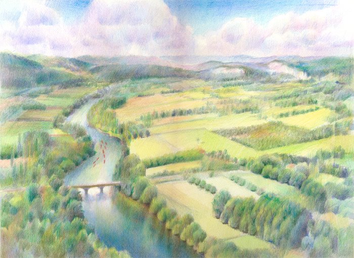
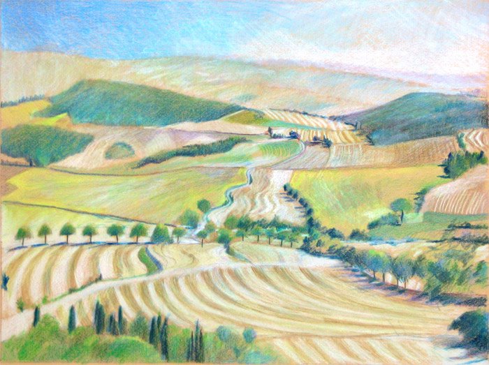
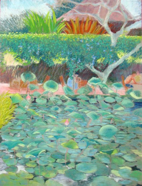
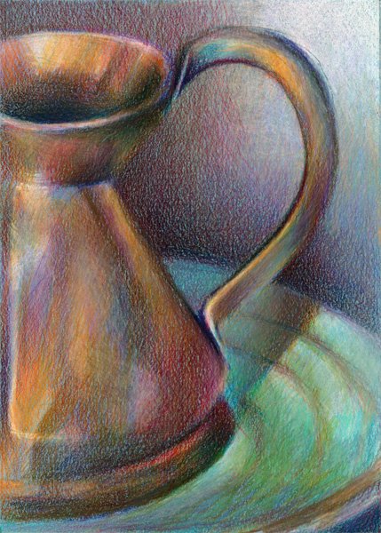
And this is the large pastel painting (25.5" x 19.5") I did at the cafe. I still enjoy drawing something accurately if that's what takes my fancy - but now I have a choice and I can scribble too if I want too!

Friday, February 10, 2006

On the Vine

This is a new Small Work (7 x 5") - drawn from life using coloured pencils on black Canson MiTeintes paper. It's not going on the website as I'm having problems with the various reds which appear to be sinking into the black paper I've used.

It's a problem I've noticed before with other colours. I've tried using the normal "work around" for this problem which is getting a neutral white underpainting down first - but it doesn't appear to be working on this occasion for some reason - very frustrating.

It's also really difficult to get a good scan on the black paper. I think I'm going to start using a neutral coloured frame to hide the bare black paper before scanning work on black paper as all the paper which isn't part of the image completely dominates the colour profile of the scan and I always end up having to do an awful lot of adjustments to get it to read true on screen . Well my screen actually - as your screen probably has a different colour calibration.......... which is a whole different topic!

Anyway, this was just to record that not everything always goes according to plan! But I've always found that you can always learn something from art work that doesn't quite "work" and apply that learning next time...........

, , , , ,

Spring Fair

I was at the Spring Fair 2006 at the National Exhibition Centre yesterday to source some of my supply requirements and to meet with a potential printer and distributor of my work in the gallery part of the show. I also made some useful contacts who provided me with lots of good information and some new ideas. The big advantage of going on the last day is that the whole place is a bit less frenetic than earlier in the week and exhibitors have more time to talk.

And finally.......... (and at long last!) I found a fine art scanner for my large pastels who's local to me. Now to find a way to make the scanning size as cost-effective as possible..........

It was interesting to hear that some of the smaller galleries commenting on how they could have done even more business than they had planned in terms of providing printing facilities for artists - which I guess is some indication of the way the giclee market is taking off with the direct marketing and selling being done by artists.

Wednesday, February 08, 2006

Blogs Illustrated

Now that I've got a few posts and a track record of posting under my belt I've joined Blogs illustrated - which is a ring of nearly 300 illustrated blogs. Well when I say I've joined I've had the e-mail back to say I've been registered but it looks like the addition to the member list might take a teeny bit longer.

When I first started this journal, Blogs Illustrated was one of the places I looked to see how other people illustrated their blogs with their own drawing and paintings (as opposed to photos). So, if anybody reading this would also like to join the ring, check out whether you comply with the requirements for membership - which are, to quote Blogs Illustrated, as follows:

Member sites need to be able to say "YES oh YES, YES, YES" to ALL of the following questions:

*
Is your site a blog/weblog/journal?

* Do you put pictures in your blog to either illustrate your words or to do the talking for themselves? i.e are you blogging with pictures? This is not to be just a showcase for drawings, they have to be working to earn their keep, telling a story or your story or a fictional life blog, or just being there in a sequence.

* Do you generate/create/paint/draw/collage/sculpt those pictures yourself? (either in the real world or on the computer)

* Is your work original? What we're trying to say is that floaty pictures of pixies with teardrops running down their cheeks and manga/anime/fantasy wannabe stuff won't really fit this web ring. LET ME SAY IT AGAIN:::: NO MANGA, NO ANIME, NO FANTASY (MIDDLE EARTH, PIXIES, ELVES, DRAGONS BLAH BLAH BLAH...I'm sorry, but a. those things are HUGELY covered else where in the internet and b. well, you don't want to hear b.)

* Do you update your site regularly with new work? (at LEAST once a fortnight, generally)

The full criteria and suggestions as to what people should do before they apply to join can be found here.

, , , , ,

Calling all foodies

You will find food periodically crops up in this journal. How can I put it - I like my food - just a bit too much at times, some may say - but I don't go out to dinner with them on principle!

I've already recorded when the still life takes over the supermarket shopping and thought that maybe it was time for looking at food the other way round. And what better way to do that then to say that I am getting a very great deal of vicarious pleasure from looking at Laura's (Laurelines) project for February - sketches of food. They are simply gorgeous sketches and she is drawing some wonderful food - and yes, ladies, she's already got one chocolate post with "Random acts of chocolate" but I don't suppose that means there won't be another one.

Anyway, get on over there to Laurelines and take a look because that's what I'm doing on a regular basis - and when you've finished reading the posts don't forget to take a look at the Gallery for February's food sketches

, , , , ,

Tuesday, February 07, 2006

Changing my thumbnails

I've just completed an exercise to change how all the thumbnails in the various galleries on my website show up. Instead of cropping to the centre of the image they are now small versions of the image which has been posted to the site. So it's now possible to see all the images in their entirety albeit in a very small size. This makes it a lot easier for me to print out web pages to give people a flavour of what sort of work I do.

I've also created a site map using AddMe's Site Map Generator and had that inserted into the website to aid those little creepy crawly things which aid traffic flow.

,

Sketching at Barts

I had an operation last year and was back at Barts Hospital - the oldest in London - yesterday for a check-up. So, never one to miss an opportunity I took my sketch book with me and did a couple of sketches. The first is a very quick one (no more than 15 minutes) of the backs of heads in the waiting area within outpatients.

The second is of the area to the left of the altar of St Batholomew the Less. This church started as a hospital chapel within the grounds of the hospital in 1184 and was rebuilt in 1789 and again in 1823 and was also restored following damage in the second world war. Rather an odd match of styles internally - but a very quiet and peaceful place to draw.

Both drawings were done in my black Daler Rowney hardback sketch book using a mechanical pencil. The one of the church is a double page spread (size A3)

, , ,

Sunday, February 05, 2006

Half Pint Jug #2

This small work (7" x 5") is a painting of a small half pint copper jug done from life. The work is coloured pencil on smoky blue Canson Mi Teintes. It's being added today to the Small Works Gallery on my website.

One of the challenges of this piece has been about getting this very old copper half pint jug to gleam without looking too shiny or bright. I also found that I could see more and more colours as I looked at it and it has been a pleasure to tease out all the different hues. I've been surprised by the quantities of celadon, aqua, blue, violet and magenta and variations on these colours that I've added into the painting to achieve that copper 'look'.

As is my usual habit, I've also used many of the colours I found in the jug and the plate in the background - but in quite different quantities. I find this always helps to unify the painting as a whole. It stops the background looking as if it's not really part of the painting - a fault often found in paintings where the background has been added in at the end rather than being an integral part of an image which has been thought about from the outset.

My jug had already acquired a rather interesting set of dents (on the other side from the one seen here) when I bought it at a small dealers in Suffolk some 25 years ago and I'm planning another view of this once I've worked out how to get it lit.

, , , ,

Information about Pastels (1)

I'm adding some links, within this post and the Painting and Resources section of this journal, of sites which provide information on the Internet for people starting out in pastels or wanting to learn more.

The links are:
  • Wet Canvas - Pastel Forum's Pastel Library - the library includes an index of information about a very wide range of art resources relating to soft pastels and oil pastels. It also provides information about artists identified by the forum as "Masters of Pastel"
  • Artshow.com - Pastel Resources. This provides tutorials and information about techniques and tips about working with pastel

Art Quotations of the Week - 5 February 2006

I collect quotations about art. I find they usually make me pause for thought and often give me an insight or an alternative perspective on being an artist and the process of creating artwork. And, of course, sometimes, they just remind you that there's nothing new under the sun and whatever problem or dilemma I am currently faced with has been experienced by somebody else before.

I've got art quotations on my website - I find they can often be a succinct way of highlighting what you want to say about a page without it actually needing to be my words.

I'm going to post a few art quotations each week - because I'll never be able to just limit myself to one! I thought I'd start by identifying those I currently have on my website and why I chose them

Painting is just another way of keeping a diary"
Pablo Picasso

I love this quotation - it speaks of the way in which painting records your life and experience. I love my sketchbooks because they record my travels and different times in my life in a way which nothing else could ever do. I look at each drawing or painting and I remember doing it, where I was sat, what the place/weather/people were like and how it made me feel. Because you connect so strongly with a place or a person or an object when you draw or paint it, the process stores away memories in a way that photos never ever can.

I've used the Picasso quotation to kick off the introduction page of the "Travels with a Sketchbook" ection of my website

(I wonder if Picasso would have had a blog with a daily painting ;) )


"Nothing makes me so happy as to observe nature and to paint what I see"
Henri Rousseau


The quotation by Rousseau is on the introduction page to the galleries of Landscape paintings on my website. I've been painting landscapes for very many years now and most of them were started or completed working from life "en plain air" in front of the subject. The Rousseau quote really summed up for me the way it makes me feel - especially when you get a good site and nice weather.

And I've posted two photos of me plein air painting using pastels in Devon. It looks idyllic in the first, but the second shows what it was really like - not the easiest place to sit! But it was still a truly wonderful and very memorable morning!

What I wanted to do was to paint sunlight on the side of a house"
Edward Hopper

Me too! I love painting sunlight and shadows and I use this quotation to start the gallery of paintings of Houses and Gardens within the Landscapes section of the website. There's an awful lot of sunlight and shadows in that gallery! And it includes my very first "sunlight on the side of a house" painting. It's called "The Lemon Tree House" and it's a painting of a small greek house (in Volissos on the Greek island of Chios) with amazing shadows from the lemon trees on its white painted walls. And that's not dodgy perspective drawing - the wall was in fact falling down and lurching very badly! It's not the best painting I've ever done but it was the first one when I began to realise what I might be able to accomplish as it generated a "Wow" reaction from everybody I was painting with. I completed it in one sitting of maybe two and half hours in pastels on an abrasive support (Rembrandt pastel card). It measures 19.5" x 25.5"


Whoops - nearly forgot the Tags
, , , , , , , , , ,

Saturday, February 04, 2006

Technorati tagging

I've started tagging each post using Technorati tags.

What's a tag? Well Technorati suggest we should think of it as a simple category name. If I tag a post it means that when people search blogs listed with Technorati for (say) blog posts relating to "painting" my post should be in that list - once I've "pinged" it to Technorati.

If you click on any of the tags below a post in this journal you'll be able to see any related posts in other blogs. I've only done a couple so far but will be working my way back through all the posts and tagging them. All future posts will be tagged as well

And I'm proud to announce, I've created a brand new tag - "artwork from life". Tada!!!

Better to do some for this one now!


Thursday, February 02, 2006

Painting from Life

Most of what I do in terms of my artwork is usually related to painting from life and I thought I better say a few words about what this means rather than assuming that readers of this journal understand what I'm wittering on about.
  • "Working from life" means working with the subject in front of you whether it's a landscape, an interior, a still life or a person, No photographs are involved, there is no tracing or projection of the subject. The artist has to sight size the subject and make judgements about values and colours using their eyes and the experience and skills they have developed through working from life. Bottom line - it's essentially about trusting your eyes and drawing and painting what is in front of you.
  • "Plein Air Painting" is a term derived from french and is frequently used to describe painting from life in the open air and out of doors and away from the studio. It's also sometimes used as a euphemism for painting nature and the natural world. There's a good description of plein air painting and how it came about on the website of the Plein Air Painters of America. There is a further succinct glossary entry defining "plein air" on the Tate Gallery's website
  • "Life Drawing" is a term usually used to describe drawing (or sometimes painting) a person or people lying or sitting or standing or moving in front of the artist. Life drawing is often identified by artists who work from life as being the artistic equivalent of the scales which musicians practice on a regular basis. Skills in life drawing enhance and underpin a lot of the skills required to draw and paint from life. Life Drawing went out of favour amongst the art establishment and colleges at one point but seems to be experiencing a bit of a revival.
  • Working from life indoors - I don't recollect ever coming across a universally accepted term like "plein air painting" to describe artists who paint from life but do so indoors.
  • "Studio works" is a term frequently used to describe artwork which originally started life as a drawing or painting from life. The information in the original study is hugely valuable - but maybe it was not completed or the artist feels they can improve on it and hence continues to work on the subject back in the studio. Monet for example, when painting Venice, started an enormous number of canvases in Venice in front of the subject - but completed them at Giverny in the studio. However, it needs to be noted there is no guarantee that an artist who indicates that they work in a studio is actually working from life - they may be working from photographs
A lot of the drawings and paintings on my website were produced working from life. Others are developments based on the colour studies or drawings produced on site and in front of the subject and sometimes supported by photographs I took while painting - although these typically relate to painting plein air.
In the past, I have produced and completed large pastel paintings on site - working either "plein air" or indoors (and a signiifcant number of these these can be seen on my website) - however I now tend to focus much more on sketching and gathering material using coloured pencils so that I have a lot more information to work from when I get home.
I'm going to develop a set of links to sites concerned with plein air painting - something which I feel very passionate about. I've kicked off the section with a link to PAPA otherwise known as the Plein Air Painters of America.

Wednesday, February 01, 2006

Interior scenes from life

Today I signed up for a project - "Interior Scenes from Life" in the new Wet Canvas Artwork from Life Forum. The idea is to draw or paint an interior from life (ie no photos allowed) during the month of February.

I very much enjoy working on Interiors as some of the early posts on this journal evidence. My Interiors Gallery of drawings on my website has been highlighted as a reference for the project - as has Laurelines Gallery of Interiors from Laura's January project to draw an interior everyday. I so admire Laura's tenacity with this project. She's turned out a stunning gallery of drawings of various scenes. I love the commentary which goes with them in the January section of her weblog. I also very much like the other references which Jamie has chosen to get the creative juices going - some Edward Hopper Interiors and a website gallery of paintings by an artist called Charles Sovek who I've not come across before. He refers to them as "colourful indoor encounters" and they're certainly very colourful. I'm sure all three artists will be very stimulating in their different ways.

I tried using a sub-gallery on my Interiors gallery page and I'm still not sure whether I want to keep this or not - I'm not sure people realise that there are more images underneath when you click on the main gallery image. Which is a pity as it's for the drawings I did for "Drawing the Bigger Inner Space" of the Interior of St Paul's Cathedral

Now the big question is - do I tidy up or not?

Or do I go back to St Pauls and do that scene I spotted near the end of my series of visits? It's really nice to have the option of hopping on the tube and being there in not very many minutes.

French Window

I was commenting to a fellow artist yesterday about what happens when the Mistral starts to blow in France and makes plein air sketching almost impossible and rather unpleasant. And I started to relate some of the things you do instead - such as looking around to see what has some appeal for drawing purposes. Which is how I came to draw my "French Window" in the late summer of 2004 (and how I learned how to sketch in a car - but that's for another post).

One should never ever judge old French houses by their exteriors - the plaster may be coming off, the windows may need a lick of paint (that sun really gives paintwork a beating in the south of France) but inside you may see gilt mirrors and chandeliers - as indeed were visible in this window. This window was across the road from the house I stayed in Montreal de l'Aude in the Languedoc. I sat in the first floor sitting room, opened the windows and drew.

This was completed using a limited number of coloured pencils on a sheet of blue grey Canson Mi Teintes (smooth side - not the really horrible chicken wire side). I aimed to balance out an accurate drawing of the window and its surrounds (and yes it wasn't square - it was old!) with coloured pencils used in a looser way. I cut the pencil 'lead' long and then dragged it across the page - pretty much as one might do if using a pastel. The real challenge was to get the sense of the reflections in the windows at the same time as using very similar colours to represent altogether more substantial aspects of the building. But I loved doing the stonework and the bricks.